Behind the Grid: Designing Custom Monogram Logos, Packaging Box Dielines, and Fluid App UI/UX Layouts
In the world of commercial art and design, the difference between a mediocre brand and a premium identity lies in the invisible grids, the mathematically calibrated curves, and the deep understanding of print chemistry. At LOGOCREATIVEARTS, we don't just draw shapes; we calibrate visual solutions that balance aesthetic elegance with functional performance.
Today, we're stepping behind our workspace screens to show you how we developed six of our latest client commissions: from initial pencil sketches to finalized vector files, compressed and optimized for rapid web rendering.
1. The Anatomy of a Luxury Mark: AM Monogram Logo
Monogram design is deceptively difficult. It requires merging two distinct alphabetical characters into a singular, balanced emblem without losing readability. For the AM Monogram Logo, we combined the upward-sweeping diagonals of the letter 'A' with the central valley of the 'M'.
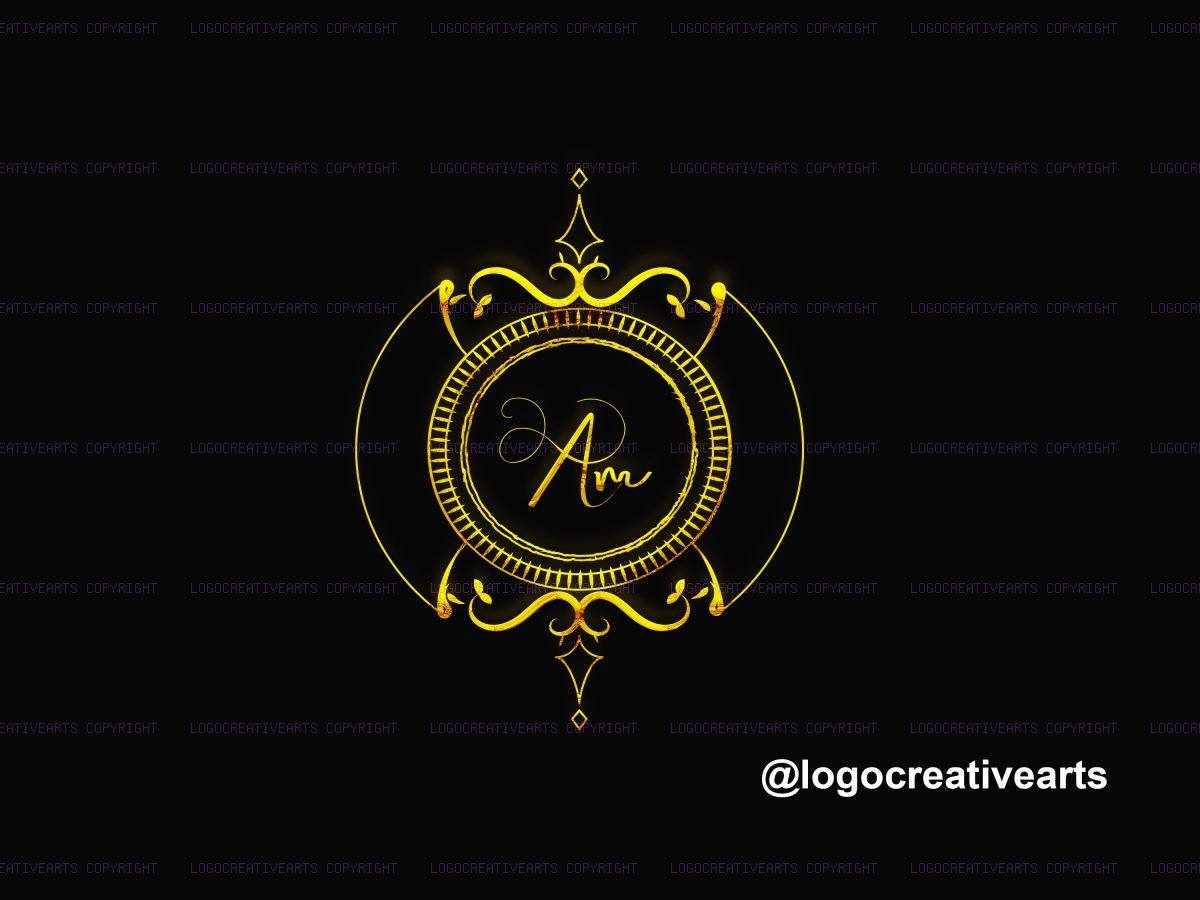
We aligned the intersection points on a grid utilizing 1:1.618 golden ratio scaling. Once the vector paths were anchored in Adobe Illustrator, we applied a custom gold gradient. Instead of standard solid yellow tones, we blended six color stops ranging from warm copper to cool platinum reflection. This mimics real-world chrome lighting. Finally, we added a subtle inner-bevel stroke to give the mark a 3D embossed look suitable for luxury print labels and gold-leaf business cards.
2. Designing for the Shelf: Zenith Almond & Aura Papaya Packaging
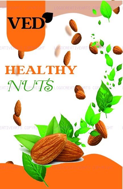
Packaging design is a multi-dimensional challenge. You aren't just designing a flat sheet; you are designing a box that will be folded, stacked, and viewed from multiple angles. We worked on two distinct box structures: a minimalist matte concept for Zenith Almonds and a tropical retail wrap for Aura Papaya.

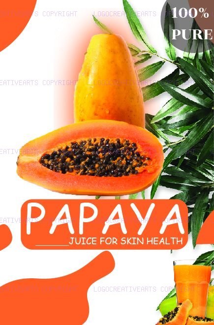
For Zenith Almonds, we utilized a clean cardboard base layout combined with a high-contrast white and dark-green sleeve. We mapped a custom vector window cut-out that allows customers to view the actual almonds inside. For Aura Papaya, we went in the opposite direction, utilizing vibrant tropical gradient fills and large organic leaf curves that stand out on retail shelves. Both designs were exported as vector PDFs with precise dielines, glue margins, and scoring paths, ensuring zero alignment shifts when sent to print production.
3. Crafting the User Journey: Delicia Cake & Neon Shake App UI/UX
Modern branding doesn't stop at physical boxes; it extends onto mobile screens. A brand's digital app must feel as premium as its physical packaging. We designed custom app screens for Delicia Cake Ordering and a Neon Shake Juice Delivery prototype.
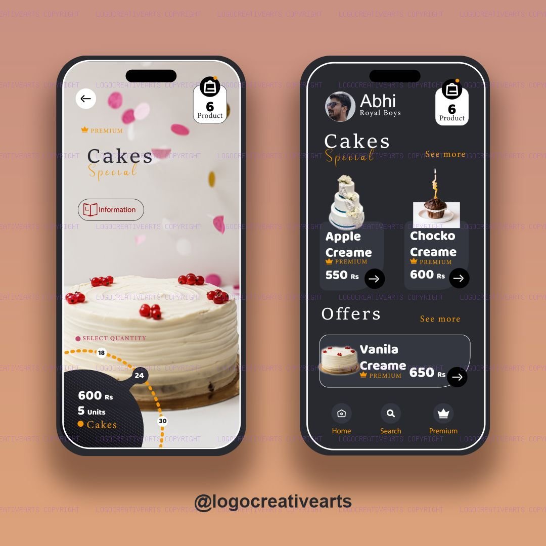
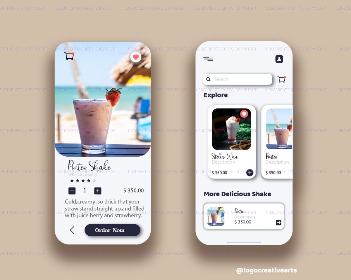
For Delicia, the layout centers around high-quality food photography. We used a soft, warm pastel background and semi-transparent glassmorphic panels so the UI feels light and airy. For the Neon Shake app, we focused heavily on motion navigation. We designed a slide-collapse navigation drawer that dynamically scales the main screen down when opened. We paired this with bold neon gradients to match a younger, fast-paced consumer demographic.
Speed is Key: The Science of Image Optimization
As designers, we often want to display raw, uncompressed 20MB files to show every detail. However, slow loading times destroy user experiences and harm Google SEO ranking metrics. To maintain our agency website speed, we passed each of these designs through our browser-based image compressor.
By resizing them to a maximum width of 1200px and saving them with 80% JPEG sub-sampling, we reduced the combined file sizes by over 93%—shrinking multi-megabyte exports down to under 180KB, without visible loss in sharpness. This ensures that whether a client is browsing our work on a desktop or a mobile 4G connection, our portfolio loads instantly.
Which design style fits your brand archetype? Minimalist cardboard box dielines or glowing metallic monograms? Let's discuss your project goals on our Contact Page and turn your ideas into vectors!