

Designing for Dark Mode: Color Principles and Contrast Adjustments

Core Focus: Dark UI Contrast & WCAG • Intent: Informational
Designing for Dark Mode: Color Principles and Contrast Adjustments
💡

Strategic Insights & Executive Summary

A guide to designing dark mode user interfaces. Learn how to adjust contrast ratios and adapt brand logos for dark background stylesheets.

🎯 Focus: Dark UI Contrast & WCAG ⚡ Intent: Informational 🏢 Applied Studio Practice

With dark mode supported across major operating systems, designing interfaces for dark backgrounds is no longer optional. However, creating a dark mode isn't as simple as flipping white backgrounds to pure black. It requires careful color adjustments to ensure readability and maintain brand styling.

Key Design Rules for Dark UI layouts:

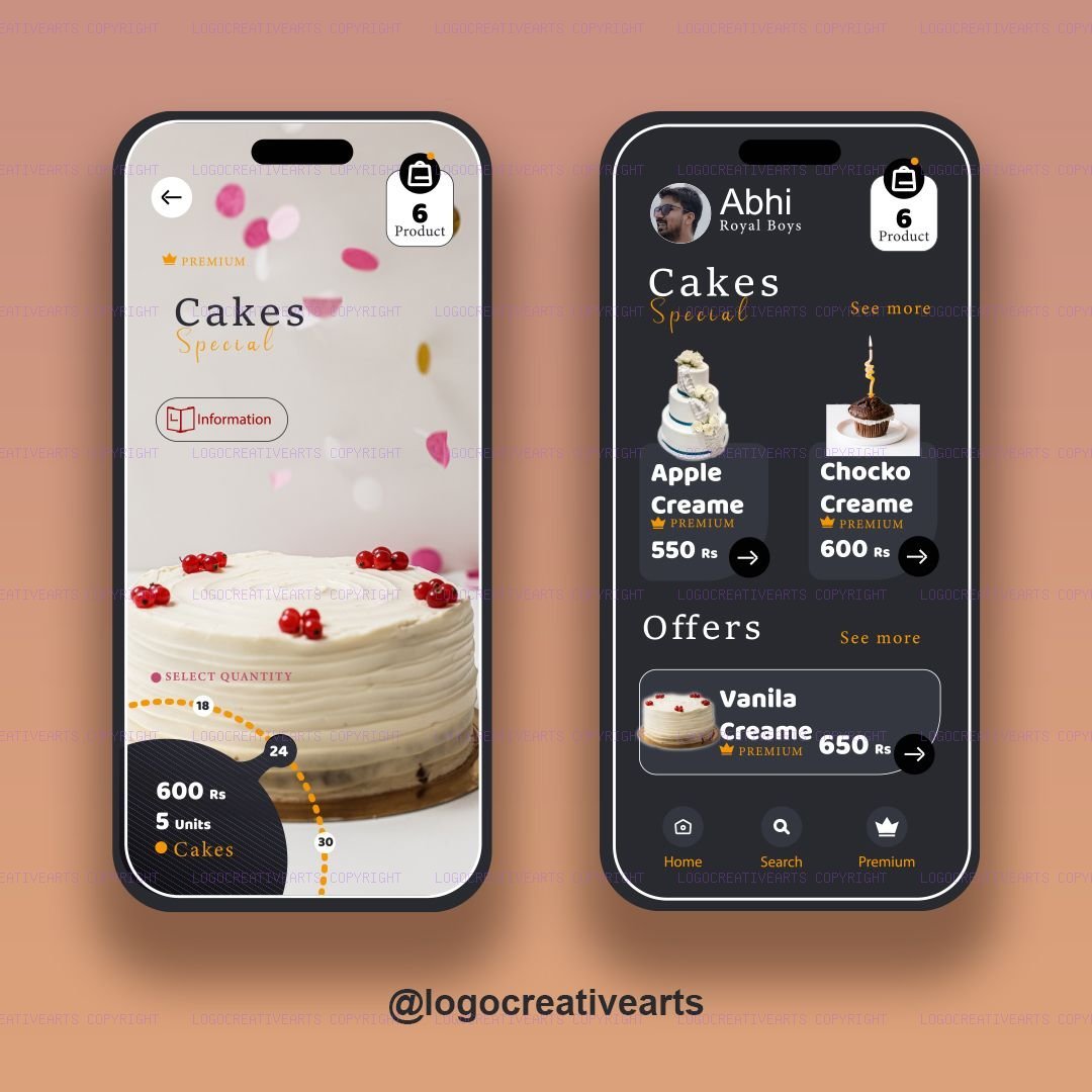
  • Avoid Pure Black Backgrounds: Using absolute black (#000000) creates high contrast with white text, causing eye strain. Instead, use dark grays (#121212 or HSL gray tones) that look dark but provide a softer display.
  • Adjust Contrast Ratios: Follow WCAG AAA guidelines. Ensure text elements maintain at least a 4.5:1 contrast ratio against the dark background.
  • Soften Brand Accent Tones: Highly saturated brand colors that look great on light layouts can look harsh on dark backgrounds. Desaturate accent colors slightly to avoid glowing line elements.
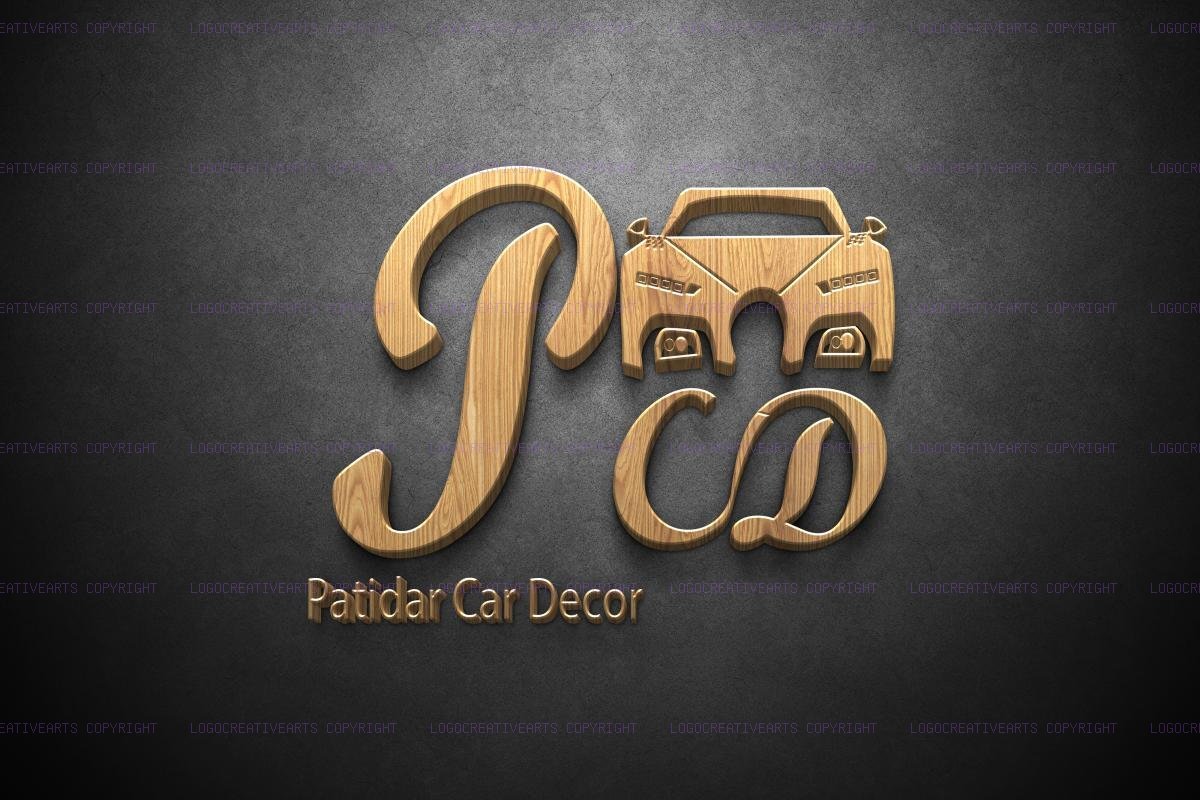
  • Adapt Logos: Monograms and logo text should include alternative styles (such as white or gold variants) specifically optimized for dark layouts.

By implementing a well-calibrated dark mode stylesheet, you accommodate user preferences and deliver a comfortable viewing experience at any time of day.
Key Questions Answered

Should dark mode backgrounds be pure black (#000000)?
No. Pure black creates high visual glare and eye strain with white text; dark slate or deep charcoal (such as #121212 or #0a0a0c) produces significantly smoother optical comfort.
What is the minimum WCAG contrast ratio for body text in dark mode?
WCAG AA requires a minimum contrast ratio of 4.5:1 for standard body copy against its background surface.

Apply These Concepts to Your Business

Bridge strategic theory with live creative tools, proven client case studies, and studio design execution.

💼 Commercial Service

Bespoke Logo & Brand Identity

High-precision vector marks, geometry grids, and custom typography identity systems.

Explore Service
⚡ Interactive Tool

Color Palette & Contrast Studio

Generate accessible harmonious HSL color harmonies with WCAG checks.

Launch Tool Free
🎨 Case Studies

Web Design Portfolio

Browse real-world identity deliverables, packaging prototypes, and digital proofs crafted by our studio.

View Works (Web)
Direct Studio Collaboration

Ready to Elevate Your Brand Strategy?

Speak directly with our senior creative directors to map your brand identity, packaging production, or visual system with guaranteed precision and commercial trademark safety.

Request Strategic Brief Instant WhatsApp Chat
All Topic Guides
Share Guide: